Having used the new myspace for the last week or so, it’s definitely back and the team at Josephmark have done an amazing job to really bring something fresh to the table.
In an interview with Ben Johnston, Designer/Director of Josephmark on Radio National’s Download This Show, Ben spoke about the core of what he believes was the root of the original myspace,
“…it was that self expression, when we uncovered and unpacked what was the root of myspace, that was one of the fundamental elements. So taking that forward into the future we wanted to build on that self expression.”
I completely agree with this. Think of the horrible animated gifs, blinding fluoro colours, unreadable text and giant images that would take ages to load (or maybe that was just my dial-up internet). It represented a personalised page on the internet that was us and that’s why we loved it. From here we could fall down the hole and analyze why myspace failed, but since that’s been done to death. Let’s just look at what’s new.
The new.myspace
I believe that the new myspace will take back it’s place as a way to find and share new music. The ability for up and coming bands to create their profile and connect directly with possible fans is were players such as Spotify fall short, as these sites require you go through an aggregator (a third-party provider that often will take some form of monetary cut from your earnings) to get your music uploaded onto Spotify. This is where myspace was cutting edge for it’s time and frankly, still is. It allows for anybody to upload and promote their music for free and gain an audience. One example of this, is the now disbanded Short Stack.
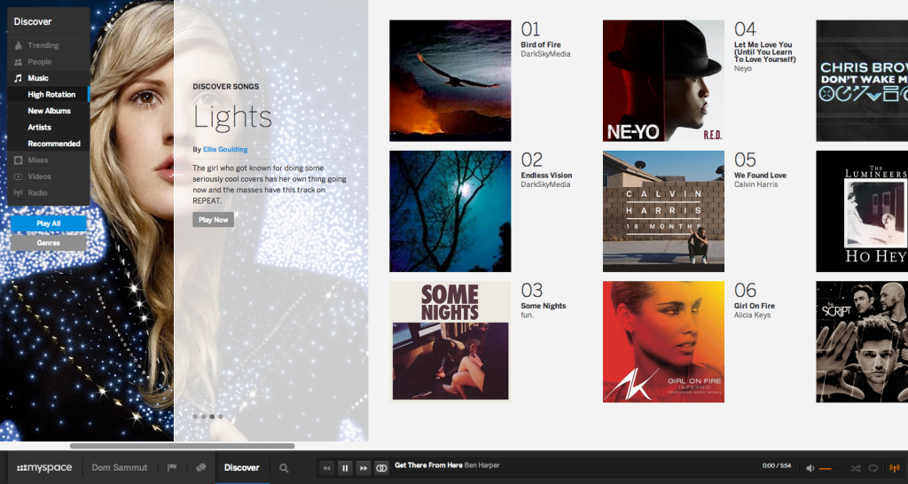
One of the best things about the new myspace is the “Discover” tool. I’d say this has probably been the best implementation of the tool I’ve seen. It puts Twitters “#Discover” to shame. While the new myspace “Discover” has the stock standard trending/popular category you also have the ability to discover all forms of media inside myspace including People, Music, Mixes, Videos and Radio. Within this you are able to filter by Genres and my favourite thing of all is that the content seems to change rather frequently ensuring that every couple hours you can browse through new material.
Horizontal scrolling. Why hasn’t it happened earlier? (Well, it has, but I think this is a really good implementation for a mainstream site). Admittedly, it took me 10 minutes of dragging the scroll bar before I realised you could scroll horizontally with my mouse. It seems so much more seamless as your (my) browser window width is often wider in size than it is in height with most monitors these days supporting a 16:9 (roughly) ratio it just makes sense.
I didn’t think I would use the radio feature on myspace, but at work it proved to be invaluable. I’m often too busy/can’t be bothered to constantly switch and change between songs/albums/artists and this feature really takes all the work out of it. Just select a genre and away you ago. Again, depending on your musical tastes it might not be for you if your very picky about your music, but for someone who’s a little bit liberal this could be for you.
I haven’t heard too much about the mobile/app version of the site, but I think it will make a seamless transition with hopefully a full array of touch gesture support. Some great designers on dribbble have already mocked up what the new myspace app version could possibly look like, just to get the ideas flowing in your head :)
While myspace has fundamentally changed, the team have included some little pieces of nostalgia:
- Return of the original myspace logo. Yes, I’m devastated too that they’ve didn’t go back to the failed my____ branding. It was my favourite.
- Setting a profile song (Remember getting heaps cut when someone else had the same song as you?).
- Top 8. I think this time though, it seems to be more of a top 8 of music, not your 8 friends of the week.
- Setting your own background image. No, you can’t customise to your hearts content, but to be fair, most social media sites these days limit what customisation you can do.
While the likes of Spotify, Grooveshark and SoundCloud already exist with varying levels of social integration I think that with the focus of attracting mainstream artists to the site will be the key to getting this new site off the ground.
Let’s see how it goes over the next 6-12 months. If you’ve already got an invite/account you can find my profile at https://new.myspace.com/domsammut.


