I’ve had the iPhone 4 since August 2010 and it has been a solid and reliable phone to it’s credit. I haven’t had any issues besides the home button sticking. With my phone contract ending in August of 2012, I quickly switched my carrier to a very cheap (although their prices have increased a little since I signed up) and reliable company called Live Connected that utilizes the Optus network. Now, to get myself a new handset.
Why not get an iPhone 5?
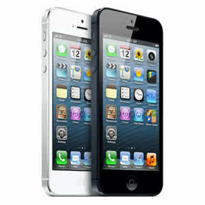 The iPhone 5 really didn’t impress me that much. A marginally bigger screen, lighter weight (I really struggle to lift my iPhone 4), lightning connector (ugh) and LTE/4G support. Of which the only thing that possibly interested me was the 4G, although my current provider, Live Connected, doesn’t support 4G on BYO phone yet. See the appendix for a hardware comparison. I have iOS 6, which again, didn’t really do it for me. Touted with over 200 new features, or in laymen’s terms, “Things that every other mobile phone operating system has had for quite some time that we thought we’d deliver it on the iPhone”. Put it this way, it didn’t make me go “Ooo” when I watched the keynote.
If I want Apple with iOS, i’ll stick with my iPhone 4
I decided that I was comparing my current iPhone 4 with iOS 6 against potential new handsets. The iPhone 5 was removed from contention due to the difference between the two in terms of hardware not being compelling enough to change and since the software is identical bar some features (e.g. Siri, panoramas, and the 3D maps) not supported on iPhone 4, it just really wasn’t reason enough to upgrade. So I began looking for a radical alternative. I thought about a Samsung Galaxy S3 but I felt that the similarities between iOS and Android were not big enough to warrant the change. 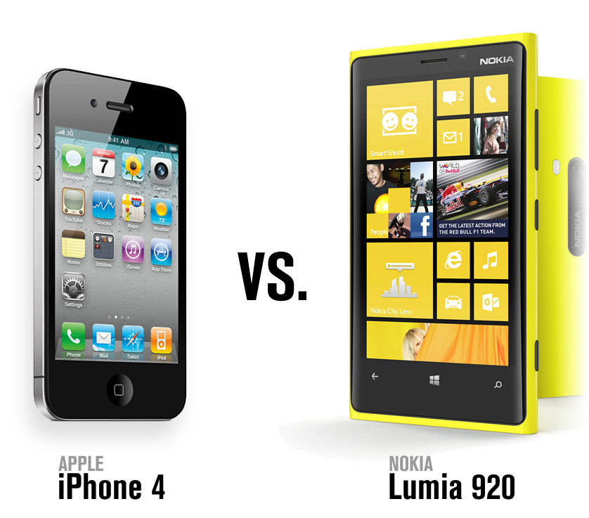 A couple of my friends had just got the Nokia Lumia 920, running the Windows Phone 8 operating system. They seemed pretty happy with the phone and spoke highly of many of its features. This was the radical change I was looking for. On a impulse I purchased the Nokia Lumia 920.
Nokia Lumia 920
From a hardware perspective, it looked pretty good, 4.5 inch display touted with Puremotion HD+, 8.7 megapixel Carl Zeiss Tessar lens and a 10.8 hours of battery life when talking over 3G. The software, is what really caught my eye. Some of the key fundamentals of what many (including me) have become accustomed to are challenged by the Windows Phone 8 operating system. See the full Nokia Lumia 920 specifications.
The first 24 hours
I turned it on and did the initial setup. So far so good. Now I wanted to tweet about my new phone, 3 minutes later, after installing and authenticating my credentials the tweet had been sent, nice and quick. However, I found the interface to be quite clumsy and far too simple, with many of the tools and features I’d become accustomed to on the iPhone not present in the client. I thought, well, if it’s anything like the official Twitter for iPhone app, it leaves a lot to be desired. I quickly found this is the case for the majority of the apps (bar the Nokia made apps, more on this later). My brain went into panic mode, o god, it’s like I’m using an operating system written in the same fashion as the Twitter for iPhone application.
…it’s like I’m using an operating system written in the same fashion as the Twitter for iPhone application.
After this big shock, I was granted a sigh of relief. To Nokia’s credit, they have developed some really solid applications for the phone, Nokia City Lens in particular stood out. I then used Bluetooth to transfer the contacts from my iPhone to the Lumia 920, which took all of about 10 seconds. This transfer really helped make the transition a lot easier. If I was at home I could have also installed the generic Windows Phone app for Mac which would allow me to move some information across from my computer. However, Nokia customers have the additional perk of being able to download Welcome Home to Windows Phone (Windows/OSX) created by Mark/Space that uses your computer as the “man in the middle” to transfer your calendars, events, iTunes music/playlists, videos, photos/albums and contacts from your old iPhone/Andriod/Blackberry phone to the Nokia Lumia 920.
I still wasn’t sold on the software, the hardware, yes, but the software wasn’t for me. Why? The operating system wasn’t as feature rich as what I had come accustomed to on my iPhone. To be fair, if Windows Phone 8 was released when iOS 3 was released, it would be an excellent operating system. However, Apple and Android have had a solid 5+ years, to build and polish their respective systems. While the Windows operating system was launched in 2010, it really hasn’t progressed as well as it needed to. To be honest, prior to writing this post, I thought Windows Phone 8 was radical change from it’s previous attempts at a mobile operating system, however, Windows Phone 8 is the second generation of the OS.
… if Windows Phone 8 was released when iOS 3 was released, it would be an excellent operating system.
I think that the OS is currently suffering from a relatively small app store compared to the likes of iOS/Android. Additionally the quality of many apps seems to be sub-par. That’s fine, other app stores have sub-par content as well, however it’s overlooked in most cases due to the number of high quality apps with large user bases. The Windows Phone Store just doesn’t have the content and apps that I want. Where is Spotify? The official Google Maps? Google+? Instagram? There are a couple of alternatives such as Metro.am however they are limited in that you can’t upload photos due to API limitations. This seems to be the case with number of high profile services (this has changed a little though, as Microsoft has written Facebook and YouTube apps). Again, I think time will do Microsoft good as more developers might move (or at least implement along with their iOS/Android builds) apps for the store.
What I liked
People Hub
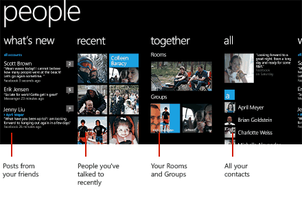
A really nice concept, integrating, your phone contacts with Facebook, Twitter, LinkedIn and any other social network you have to then see very detailed information about a particular individual. You could see their latest Facebook statuses, Twitter updates, photos, job(s), relationship status all in one hit. If you’re a social stalker, or just a stock-standard stalker, this feature is for you!
Nokia City Lens
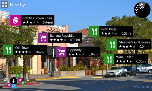
An augmented reality software that gives dynamic information about users’ surroundings. There are already implementations of this on iOS and Android, but to come as a default application was pretty nice. Additionally, it works very smoothly and seems like a really polished piece of software.
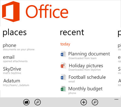
Microsoft Office
It just worked. Using a few test cases, it was seamless in creating and editing documents between my phone and laptop. No issues with formatting or anything of the like. This feature would be more useful for me if my job/personal life required that I use the Microsoft Office suite. Needless to say, compared to using the Apple suite it was far superior.
What I didn’t LIke
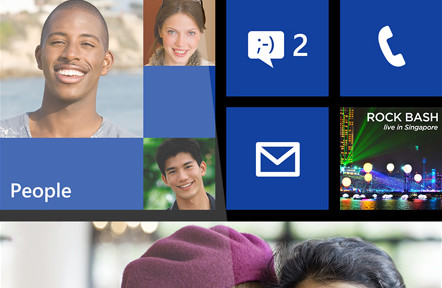
Live Tiles
They are a great concept, but it became to distracting. Additionally, it just wasn’t a very nice design layout. It looked like something I’d see in a modern art gallery with all the different shaped squares in fluoro colours.
The Windows 8 GUI
It just didn’t gel for me. With the tasks and features we’ve come to expect of our smartphones, Windows 8 has gone away with the details. This works on the surface (pardon the pun), which was what attracted me to the phone. However in the rough and tumble of using my smartphone, it became quite frustrating that I couldn’t do simple tasks. This was epitomised when using the Twitter application, although, to be fair, the Twitter app on the iPhone isn’t too flash (I use TweetBot).
Verdict
I packed it up into the box and returned it the next morning. I wanted to be adventurous, but not to the point that I was sacrificing a large portion of functionality in terms of the apps. The GUI really didn’t help. It looks really nice for the first 10-20 minutes, but when it came to do something, I instinctively put down my toy and picked up my iPhone. To me, that’s what the Windows Phone 8 operating system feels like at the moment. I’m not looking for a toy. If you like simplicity, and I don’t mean Apple simplicity, I mean single words taking 1/4 of the screen simple, then Windows Phone 8 might be for you. It’s a shame, because the hardware was really great, kuddos to Nokia.
Appendix: iPhone 4 to iPhone 5 hardware comparison
| Apple iPhone 4 | Apple iPhone 5 | |
|---|---|---|
| Weight | 137 grams | 112 grams |
| Screen size | 3.5 inches | 4.0 inches |
| Contrast ratio | 800:1 | 800:1 |
| Brightness | 500 cd/m2 max | 500 cd/m2 max |
| Camera Megapixels | 5 Megapixels | 8 Megapixels |
| External Flash | LED | LED |
| Video recording | 720p, 30 frames per second with audio | 1080p, 30 frames per second with audio |
| Battery standby time | 300 hours | 225 hours |
| Bluetooth | 2.1 | 4.0 |
| Wireless | 802.11b/g/n | 802.11a/b/g/n |
| Wireless Frequency (802.11n) | 2.4GHz | 2.4GHz and 5GHz |
| Talk time 3G | 7 hours | 8 hours |
| Talk time 2G | 14 hours | N/A |
| Internet use 3G | 6 hours | 8 hours |
| Internet use WiFi | 10 hours | 10 hours |
| Video Playback | 10 hours | 10 hours |
| Audio Playback | 40 hours | 40 hours |

https://www.domsammut.com/?p=298#comment-7#Maya Lancy
I want Nokia Lumia phone cases for my 820. I was planning to buy an iPhone but I like my Lumia better and I will change it to 920 now :)